Coming to us from writing team Nick Keller (Turner of the Century) and Zack Keller (co-creator of the cartoon Dick Figures), Death Head is a new horror comic, and I’m not entirely sure what to make of it quite yet.
We start things off with what should be an extremely familiar scenario to anyone visiting this site. There’s a couple out in the woods on vacation attempting to get “off the map” when they find a seemingly abandoned, overly-religious and ancient village that shouldn’t be there. Obviously they explore it, and obviously things go awry. From there we’re introduced to a few other characters that fit just as snuggly into familiar archetypes. Some girls at a Catholic school that don’t play by the rules and experiment with drugs as well as a young kid being bullied round out the cast. It’s all pretty standard, and if they were able to work in a crazy gas station attendant that warned them of a “death curse” I’d have won Horror Cliche Bingo.
Having seen Zack Keller’s previous work in the comedy cartoon Dick Figures and given how “by the numbers” everything in Death Head is, I kept waiting for it to take a turn into parody. I could just feel it making a Cabin in the Woods style twist, but up until the end it’s all played straight. Nothing is overly serious since the whole premise is pretty campy, but it never quite makes that plunge into the self-referential. Still, this makes me wonder exactly where it’s going. The horror tropes are so noticeable that it had to be intentional… right?
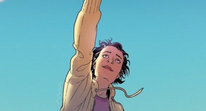
In the visual department things work well. Joanna Estep handles the art and she’s really great at creating dynamic and cinematic compositions. This first issue is more buildup and suspense than action, but the few times where things kick into motion she shows that well. The couple being attacked by a swarm of moths and one of them taking a fall are both spots that show a lot of energy and movement. Her line work is kind of loose and looks like it was done with a brush. In panels that include heavy areas of black it almost looks like something by Tim Sale, but with less exaggerated characters. Kelly Fitzpatrick’s colors compliment Estep’s work well, too. It’s probably digital, but it’s made to have a water colored appearance, which totally fits the looseness of the line work.
Speaking of nice visuals, there’s the apparent killer of the story. He only appears briefly and we know next to nothing about him, but goddammit, he looks so cool. I’m completely biased because I have a deep love for Plague Doctor masks, but seeing it in the context of a slasher villain is a great choice. It fits the Michael Myers aesthetic of having a plain white emotionless face, but with a totally different feel. It’s a mask so good that I can’t believe we haven’t seen a prominent slasher adopt it before now.With how nice the artwork is and how blisteringly standard the plot is, Death Head is a mixed bag. The plot isn’t bad, but it’s something we’ve seen a million times before. That being said, I’m really hoping that they’re setting us up to think we know where it’s going only to then pull the rug out from under us. There are a few breadcrumbs dropped throughout the issue that make me think there are bigger ideas yet to come. The Plague Doctor mask coupled with the “Ring Around the Rosie” song that gets sung at one point hint at the bubonic plague being a recurring theme. The three separate plots and sets of characters seemingly have nothing to do with each other, but I have a theory for how they’re related. Lastly, there’s one small hint of the supernatural being an element, and I’m very curious to see where that goes.
It’s too early to really tell if this is a hit or miss and it all depends on where they go from here, but they’ve at least piqued my curiosity. The artwork is great and the killer looks awesome. Check it out if you’re looking for something in the slasher vein.
Wicked Rating: [usr 7]


