Ahead of the August 8th premiere, The CW just released a new promo for their horror series, Two Sentence Horror Stories. The show, which launched on CW Seed back in 2017, was created by Vera Miao and tells contemporary tales of horror and haunting for the digital age. Inspired by the viral fan fiction of two sentence horror stories, this anthology series taps into universal primal fears, filtered through the anxieties of the most connected generation. Despite dizzying advancements in technology, inequality, social progress, and environmental degradation…the things that haunt us are still the same. To learn more about what fans can expect from the series, we spoke with the show’s cinematographer Guy Pooles. Below Pooles dissects some of already released episodes on CW Seed and what fans can expect from the upcoming season, which makes its network debut Thursday night.
Wicked Horror: All the episodes that have been released on CW Seed are pretty dark. Is that how the upcoming episodes are going to be?
Guy Pooles: With the original, digital series incarnation of Two Sentence Horror Stories, we knew that we were going to be faced with a multitude of vastly different shooting locations and environments. Even though we had an incredible production designer, Susannah Honey, the modest nature of our budget meant that we were never going to be able to rely on intricate set builds or even extensive re-dresses of each location in order to conform every episode to a unifying aesthetic for the season. Often, if a part of our shooting location was deemed to be out-of-keeping with the look or tone of the series, we would embrace darkness and allow those areas to fall away to nothing.
We also chose to embrace exposure as a unifying constant in the look of the show, specifically in regard to the key-to-fill contrast-ratio that I was embracing throughout the series. No matter where I was placing the exposure of skin tones, I would always try to keep the fill-side of the face rolling away to pure black. The thought process here was, no matter where the production took us or what the limitations of the scene might be, there was always one thing I knew I could keep consistent across the run of the show: the contrast on the actors’ faces.
On these new episodes, there’s certainly still a lot of darkness of a similar fashion. However, the showrunner, Vera Miao, wanted to push the look of the show into new directions. Unlike that first season, many of the episodes now took place during the day, and so Paul Yee (the show’s other cinematographer) and I were encouraged to work with the directors to depict many moments of horror in much higher-key lighting scenarios.


Wicked Horror: In the episode titled “Second Skin”, there is a lot of emphasis put on the color green. When Luna is walking up to the spa, the huge green tree is framed right behind her; there are green table cloths on each side of the surgeon’s table; then there is green backlighting all throughout the inside of the spa building. Why did you decide to emphasize this color?
Guy Pooles: Green is incredibly versatile. To my eye, it has more latitude in its varying tones and hues than almost any other color. Although it is heavily present within nature, it does not often naturally occur within the world of our interior lives. The lights inside our homes tend to be either warm or cool, and it’s not a color that I noticed being used too frequently in decoration. Something about the colour green, when it appears in abundance within lighting and production design, feels somewhat unsettling. That is what we were trying to harness throughout the entire season.
Our embrace of the colour green was not linked to anything specifically thematic, it was more a tool to unsettle the viewer that we utilised throughout all of the episodes. Often, we would cast green light into a scene when there was no logical motivation for where it might be coming from. We would frequently tint the warmer tungsten lights of our sets and locations to the green, making them feel sickly and disconcerting.
One of the most forgiving things about green as a colour is how easy it is to manipulate in the colour grade. We would frequently isolate items of green within a frame and allow them to pop in saturation or push their hue into a more unsettling tone. As with our use of a darker exposure, it became one more unifying visual characteristic throughout the season, to try and make the many episodes feel as if they exist within the same universe.

Wicked Horror: The digital episodes that have already been released are around 15 minutes each and the new season is going to have 30-minute episodes. How is the longer timing going to impact your work?
Guy Pooles: Well, the run time of these new episodes is actually closer to just over 20 minutes. It’s the commercial breaks that push the episodes towards the 30-minute mark. That in itself created a challenge that was new territory for me. How do you structure your visual language so that, after returning from a commercial break, the viewer is pulled immediately back into the drama of the narrative?
If an act break fell within the middle of a scene, an older school of thought would have the first shot after the commercial break be a return to a wide/establishing of the scene or even to repeat the last shot before the break.
This choice of reorientation felt wrong for the show. It would feel repetitious and suck some of the air out of the drama of the moment. It would also mean that, should these episodes ever air without commercials at some point in the future, these moments would feel incredibly bizarre. I can vouch for that as a Brit, who grew up watching US TV shows on BBC, commercial-free, and always found it very awkward when I’d suddenly have to watch the same shot twice, with a fade to black in the middle.
Our choice of how to handle this became: to just have the story continue, with no refresher or attempt at repetition for the sake of reorientation. However, we also had to ensure that the first shots returning from a commercial break had a weight to them that helped immediately define the energy and tone of the story we are returning to.
Wicked Horror: In the episode titled “Guilt Trip” there are many scenes with a very harsh back light on the characters, with their faces getting blown out. Is that to emphasize that sometimes we don’t really know who these characters are? Meaning, we think they are one thing but could be totally wrong. That seems to be the theme of the series.
Guy Pooles: Obviously, the whole episode plays upon societal stereotypes. In that regard, we wanted the way that we photographed the character of Jayson to begin to tap into cinematic clichés also.
For the scene in the car where Jayson and Michelle are first trying to figure each other out, the director J.D. Dillard had the great idea of jumping the line every time we cut to Jayson, and photographing his coverage from a french-over. This, not only slightly unnerves you as you constantly jump the line as you cut back and forth between them, but it gives you far less access to Jayson’s face, as the camera is placed behind him. Then, with the lighting, I was able to peal his key-light right back so that only a sliver of his face is lit. All this works to conspicuously present Jayson as this mysterious hitchhiker character; something of a familiar trope and one that genre movies have taught us to be suspicious of.
With this in place, the real fun came from how we then approached photographing Michelle. The hope was that our depiction of Jayson raised so many red-flags that viewers might not have immediately clocked that: Michelle’s face is also often half obscured by shadow, and that the very first shot of the episode introduces her as nearly a total silhouette.
So, yes. Even though the high-contrast look was a staple of the entire show, using light to withhold access to a character became very much a visual motif of this particular episode; all working to help foreshadow the story’s conclusion.
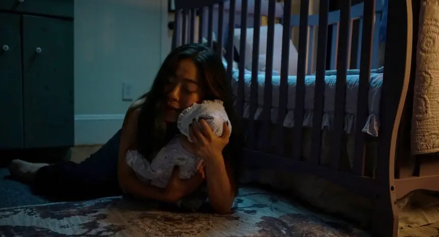
Wicked Horror: In the episode titled “Ma” there are a lot of shots angled downwards on Mona. Was the intentionally done to symbolize how little she feels under her mother’s watch?
Guy Pooles: Yes, exactly. Throughout the episode, there’s a very specific vertical power dynamic in play between those two characters.
This comes to a head in the scene where Mona is finally able to stand up to Ma and tell her how she feels. The visual dynamic shifts, and for the first time we begin to place the camera lower to look up at Mona whilst finally starting to look down upon Ma.
In contrast to this, Mona’s interactions with Erica predominately take place with the two characters on an equal plane. The camera lands at eye-height for each of them, suggesting that, for Mona, this is a far more healthy and comfortable relationship in her life.

Wicked Horror: I know you probably can’t give too much away, but do you have a favorite episode from the upcoming season?
Guy Pooles: You know, I really couldn’t pick a favourite.
Each episode strives to tap into its own, highly relatable fear or anxiety. It’s really what I enjoy the most about this show; that each episode tackles something wholly different.
I’m most curious to hear which episodes viewers felt really struck a chord with them.
Wicked Horror: You have worked in other genres besides horror. Is there one genre that is more difficult than others to shoot? Why?
Guy Pooles: There are types of scenes that are always going to be more challenging to shoot; from scenes with many characters and multiple different eye-lines, to action scenes that require many different shots in order to build the appropriate rhythm within the edit. However, I don’t think that these challenges are specifically tied to genre.
I have so much love for every narrative genre, and my approach to each one is always the same. I work with the director to define what the heart of the story is, then together, with that as our guiding star, we build a visual language for the project that pulls the viewer along on the journey of the narrative.
Sometimes, it can be very difficult to design the cinematography of a project in order to tell a specific story, but working side-by-side with a director to crack that code is also always when this craft is at its most rewarding.