Nothing is ever entirely original. That’s not a bad thing and that doesn’t cheapen any of the content we watch and love. But storytelling has been around for thousands of years and most creations follow the same basic themes. There’s bound to be repetition from time to time. Horror, in particular, is largely defined by trends. When a trope achieves large-scale popularity, studios rush to churn out something similar. These movies often manage to stand on their own. But they nonetheless borrow the basic concept from a film that’s already considered a mainstream success.
Did You Know? Wicked Horror TV Has Classic and Independent Horror Films Available to Stream for Free!
In this piece, we’ll be looking at films that lifted moments, visuals, concept, and style from not just previous horror movies but the entire scope of cinema. Artists take influences from all sorts of places. The manner in which they use and shape those influences can be the difference between a film being considered a rip-off versus a truly original piece of art.
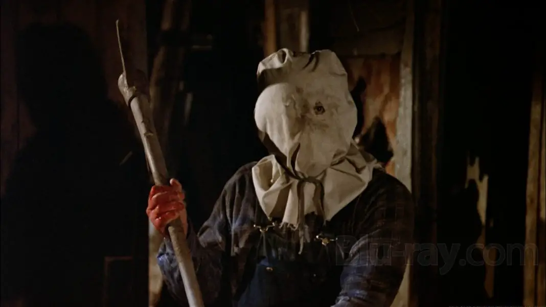
Friday the 13th Part 2
Friday the 13th Part 2 is pretty famous for borrowing one of its biggest death scenes from Mario Bava’s Bay of Blood. The spear kill is more graphic in the latter, but the setup is almost exactly the same. There are mixed accounts of whether or not this was intentionally borrowed. The two scenes are almost identical, but different enough to stand apart as examples of how American and Italian horror approach the same splatter setup.
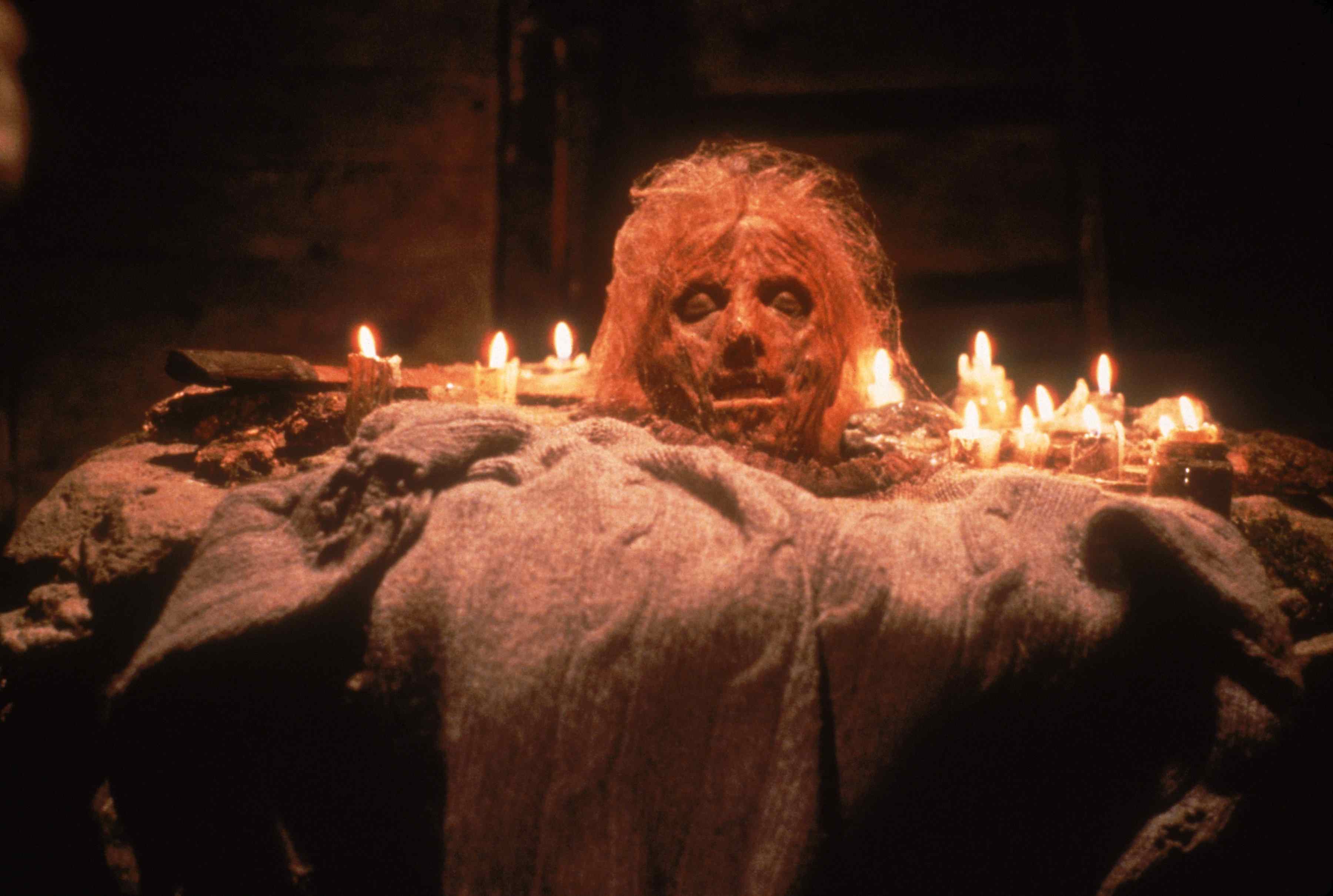 Grave Encounters
Grave Encounters is one of my favorite found footage horror films of the early 2010s. I think it’s a bitingly witty commentary on the climate of paranormal TV shows that were incredibly popular at the time. I think’s a genuinely scary movie. But a couple of its biggest scares are almost identical to a few moments in the acclaimed Spanish found footage feature REC. Both movies are great on their own. But there’s some heavy lifting going on in those moments.
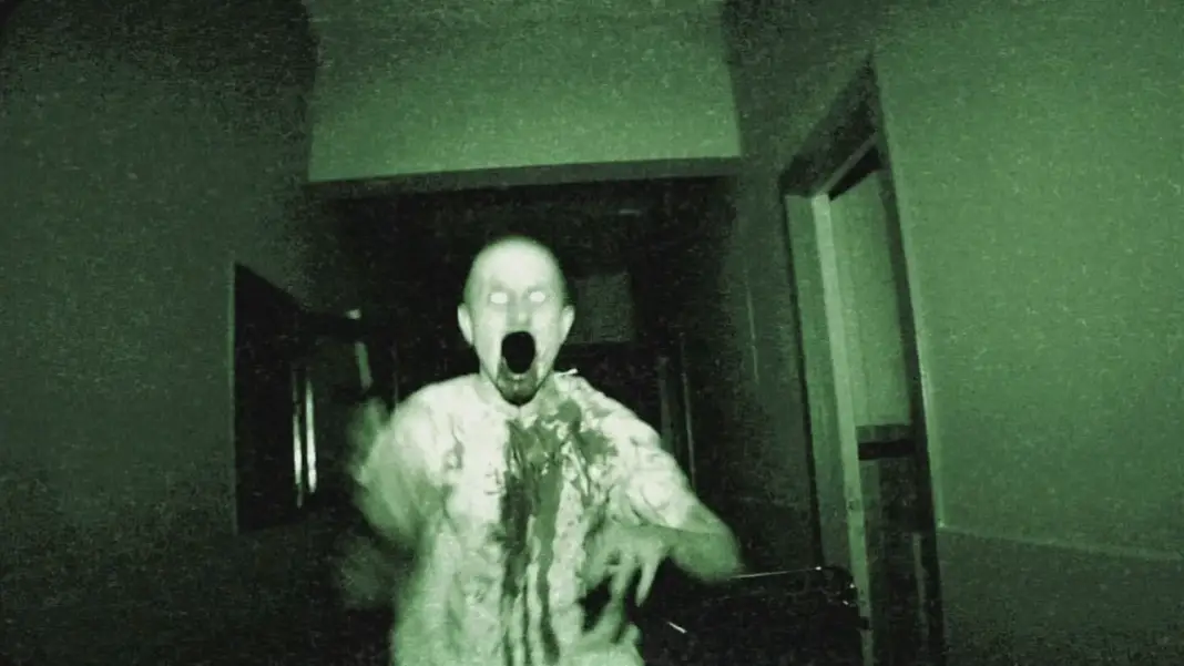
Halloween
John Carpenter is the first to admit that the iconic opening shot of Halloween is heavily inspired by the opening of Orson Welles’ Touch of Evil. In fact, Carpenter is up front about all of his influences, which is what makes him such an interesting filmmaker. He pulls from so many different sources, but his movies are so uniquely his. These scenes are not overly similar, but the impact of one on the other is immediately clear.
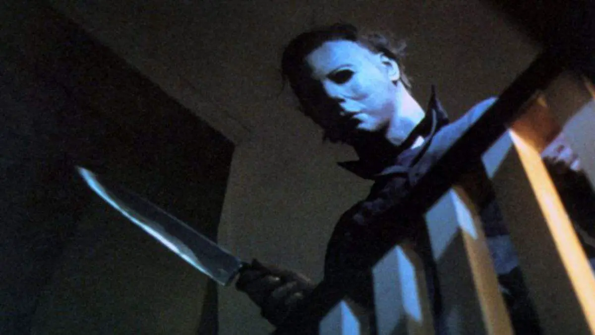 The Funhouse
The Funhouse very intentionally riffs on Halloween in its opening sequence. But it keeps going in a very strange way. Maybe it’s just pointing out that if Michael didn’t wind up just killing his sister, everything he’s doing in that opening tracking shot is undeniably creepy. But that’s also kind of the point in Halloween. In The Funhouse, the kid is just playing a prank and spying on his sister in the shower. Which is bizarre. It’s a very strange scene, not to mention a bold way to open the film.
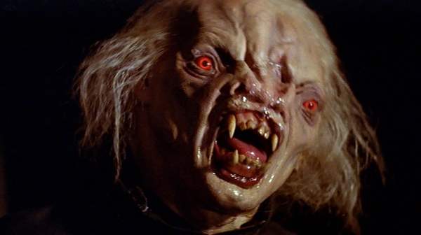 The Evil Dead
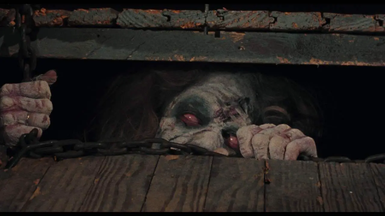
I feel like this entry is a great example of what this list is supposed to be about. Evil Dead is a wholly ferocious, original film. But at the same time, it bears many similarities with Equinox. There are scenes that have the same basic setup, but they are told in entirely different ways. Looking at them side by side is kind of fascinating. Equinox is also about a group of friends in the woods who stumble across an old book that unleashes the forces of evil. There are deep similarities, but huge differences, allowing both films to be examined on their own merits.
 Fright Night
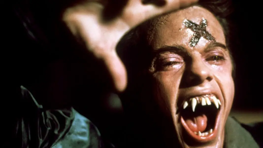
Fright Night lifts the basic premise from Alfred Hitchock’s Rear Window. But that’s just a jumping-off point for a movie that’s much more focused on serving witty commentary on the vampire genre and the way it had changed by the mid 1980s. Still, the moment where Charley discovers Jerry is a vampire and sees that Jerry sees him watching is a great nod to Hitchcock’s classic.
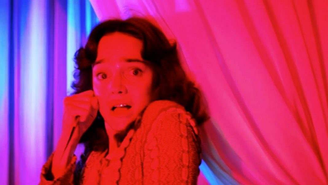
 Suspiria
It’s not a scene, per se, but Suspiria is widely known for its visual style. The fluidity and intense use of colors are usually what draw people into the film in the first place. But Suspiria’s color palate is completely inspired by Snow White and the Seven Dwarves. Argento made a specific choice, even pointed to that Technicolor animation style as what they should strive for. He wanted to convey that same sense of otherworldliness of animation, but apply it to a visceral horror story.
